Bahlsen
A family enterprise with a fresh look and feel.
Cookies are progress.
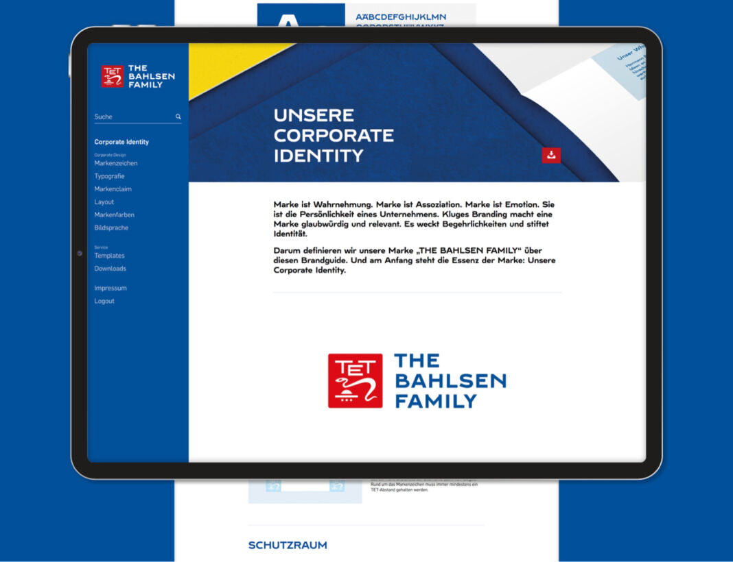
A corporate design needed to be developed for the new umbrella brand THE BAHLSEN FAMILY Timeless, traditional—with the desire to bring something new into the world. How does this look when implemented?
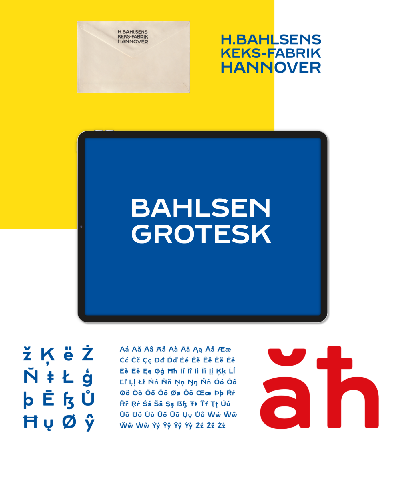
For the design, it was important to take the essential elements from Bahlsen’s history and adapt them to today’s demands. The typology was a defining element in this.
Tradition re-imagined. The result is a characteristic, unmistakable typeface, which is used as an independent design element.
The original TET quality seal returns to the new trademark and the concise Grotesk font directly expresses Bahlsen’s family aspirations in the name of the new umbrella brand: THE BAHLSEN FAMILY.

The special edition: The world's first baked brand lettering—including custom packaging
The Bahlsen Grotesk font was specially redesigned and based on a handmade typography from the 1920s. Each letter and each character was individually proportioned.

- René Bieder (Type Design)
- Strategie: sasserath munzinger +


