
OTTO
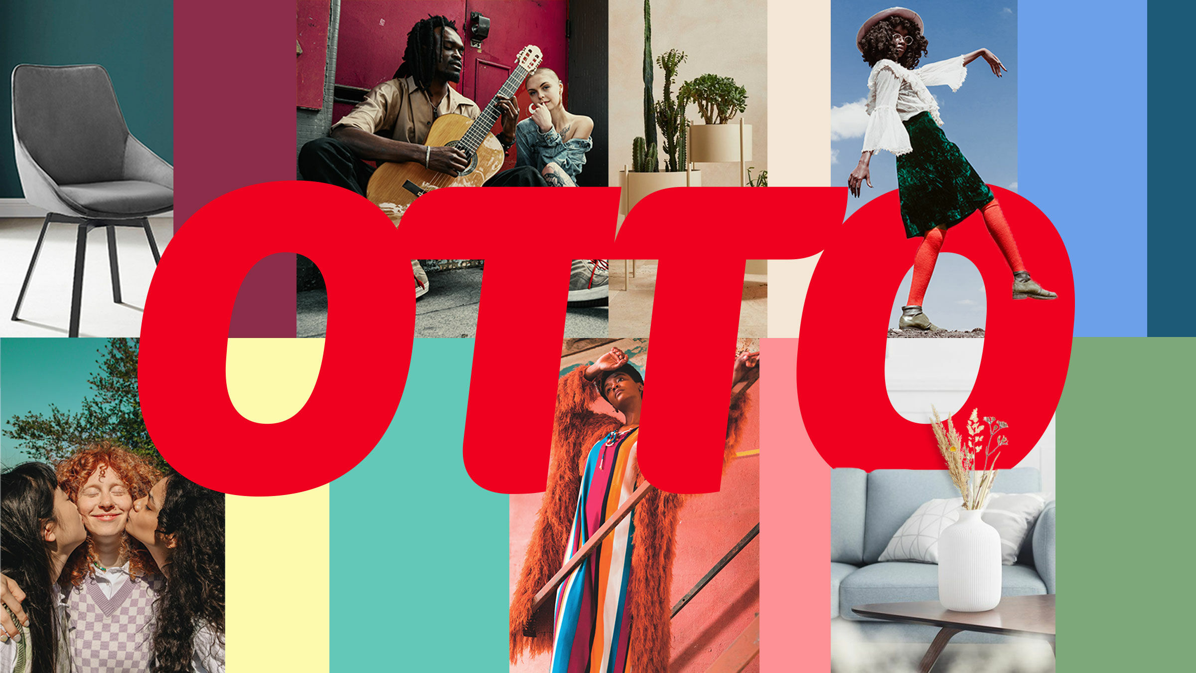
For OTTO, we developed a mobile-first brand identity that makes the brand’s shift to a platform clearly visible.
Your world in four letters.
It was our task to develop a flexible and modular design system that takes the OTTO brand to a new level and surprises all around.
We translated the brand values into the design and defined how the brand should feel at the different touchpoints.
With a new corporate typeface, a versatile color spectrum, clear layouts and an expressive visual language, we created a corporate design that makes the brand’s transformation visible.
OTTO as a lifetime companion.
The campaign “Dein Leben in vier Buchstaben” (“Your life in four letters”) stages OTTO’s product diversity on up to 90-meter-long construction fences in Hamburg, Berlin and Cologne, as well as digitally.
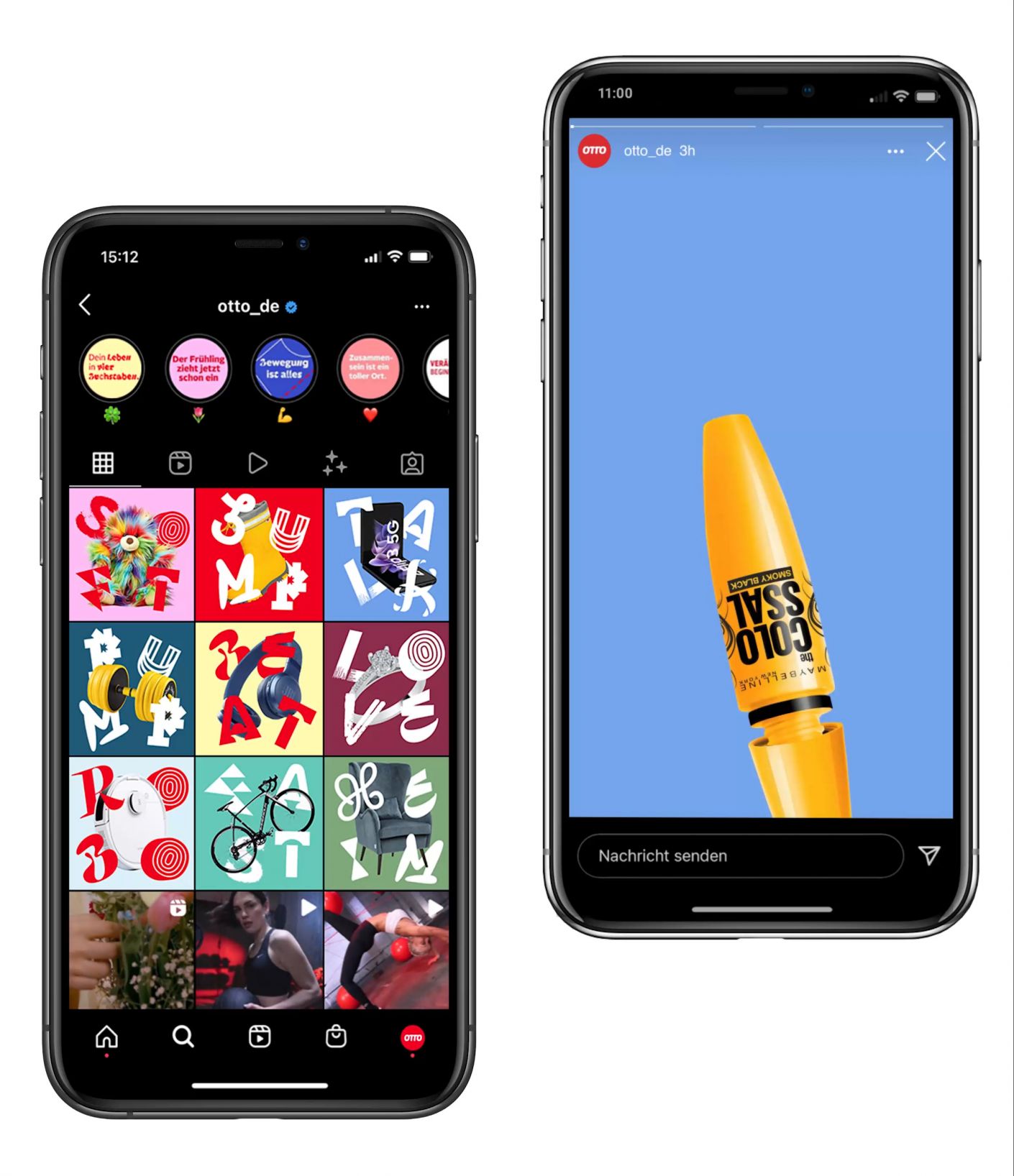
On display are different life situations, represented in four letters, for which OTTO, as a lifelong companion, always offers the right products: Pacifiers for “Baby,” headphones for “Beat,” rings for “Love,” a mat for “Yoga.”
The feed of the OTTO Instagram channel was broadcast in numerous social media assets. Animated versions of the poster motifs were also created for this purpose. Each asset tells its own story. The campaign was also implemented in numerous performance ads and on the landing page of otto.de.

OTTO Play—The new brand font.
With its contextually applied alternative OpenType glyphs, “OTTO Play” is fully integrated into the existing typography and surprises at every touchpoint—in the app, on product packaging or in advertising. What makes it special is that each of the four core values of the brand tonality is reflected in the typeface.
A font that surprises.
Each of the letters is different—but together they form a coherent typography that is as diverse as the OTTO brand.

The new corporate design.
The corporate design features a mobile-first approach that offers high flexibility and modularity and was developed with the app in focus.
Through the new, versatile color spectrum and the clear layouts, we created a concise corporate design system that draws attention to the brand like never before.
Implementation of the design.
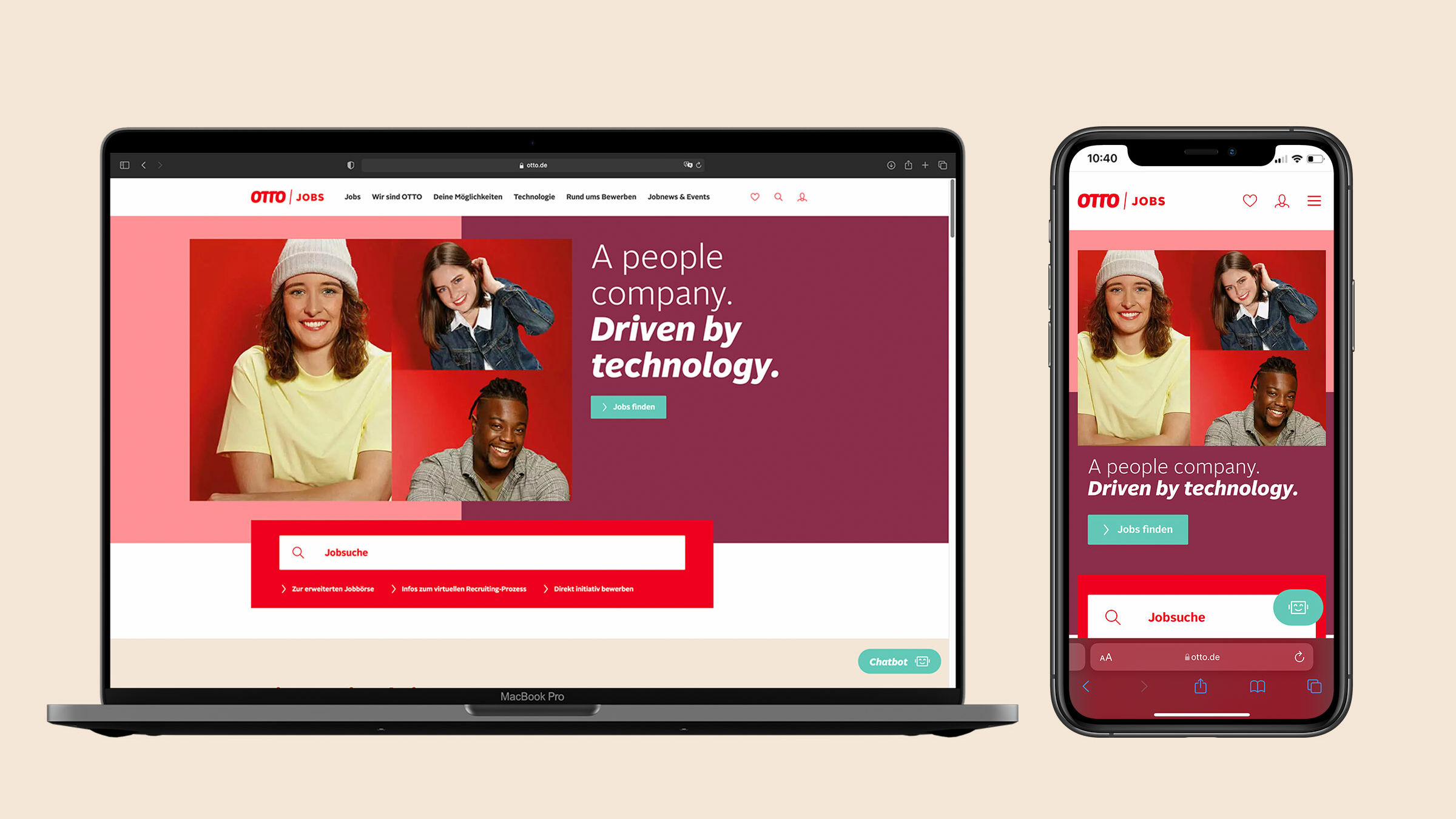
The employer branding portal “OTTO Jobs” is the first digital touchpoint that can already be seen in the newly developed corporate design. A high proportion of red, which can also be found in the visual language, characterizes the employer brand.


