Clariant
Transferring an existing design system into the future.
Less complex—more impact.
The Clariant design was completely renewed in 2012. After 8 years, an update was necessary to make it more flexible, simpler and above all more digital, without losing the identity of the brand.
The basic principle of “Clarity” remains at the core of the design and has been consistently developed from the digital touchpoints.
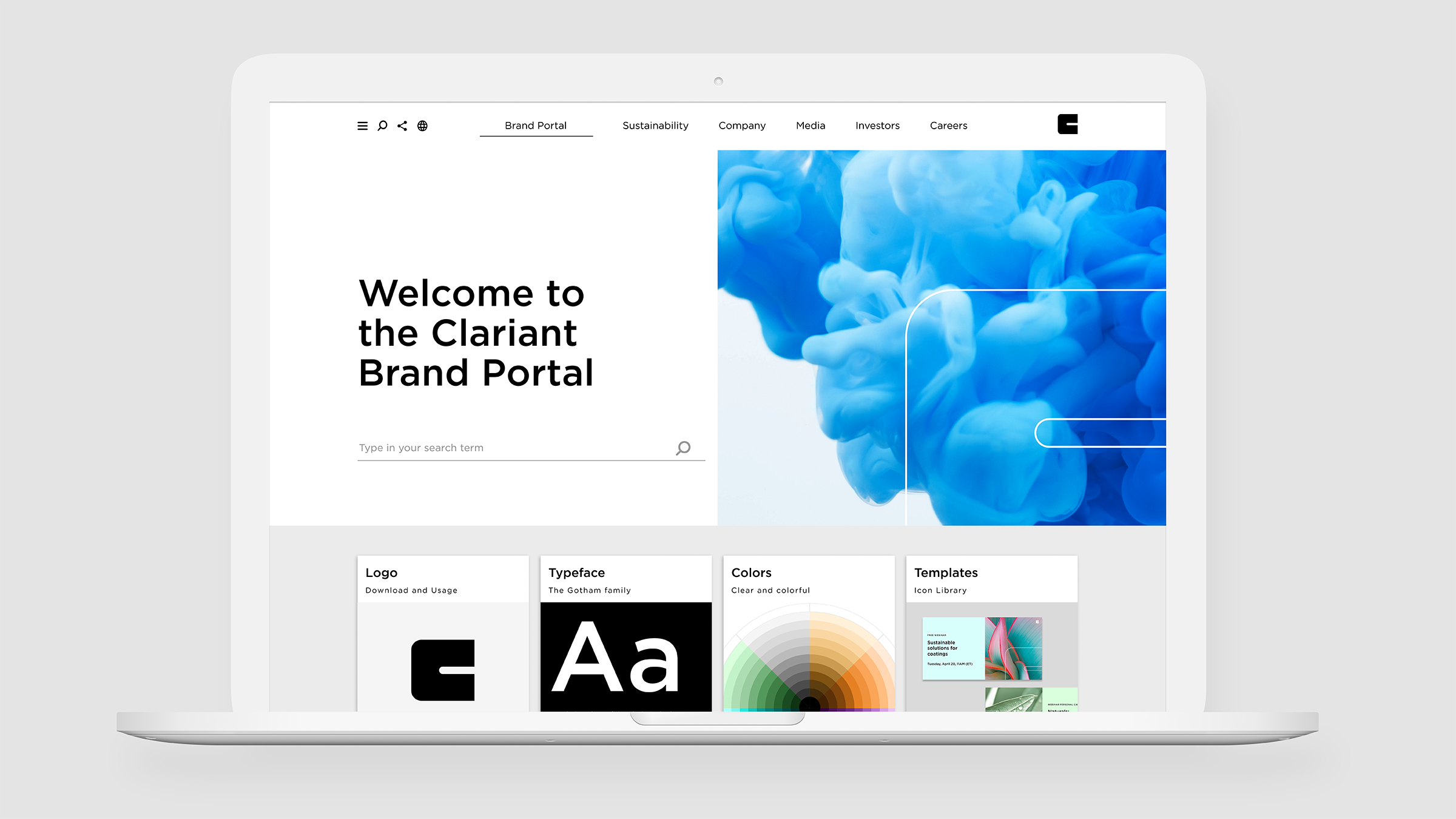
The entire Clariant design was reduced to its essentials, enhanced with some iconic new elements. Brand management is controlled simply and digitally via a central brand portal.
The badge is the system.
The new system should allow the many internal and external users a simple design that is still on-brand. The modular system makes C-badge the key unit reference for all layout templates. More colors ensure less randomness and badge, icons and illustrations follow one style. The result is a flexible and easy-to-use design.
Reduced to the digital max.
How does a design created in 2012 become more digital? One answer is flexibility. The brand gets more dynamic and reduced to the essentials so that the design can work in various digital contexts. This also applies to digital brand management, which was realized through an intuitive Brand Portal as a single source of truth.


