Redesign after 29 years
A bold new look for the next generation
mobile.de is a pioneer of the Internet age. Since then, both the web and the automotive industry have changed radically. The new iconic design positions the brand for the future – without cutting its roots. The aim is to inspire existing users while attracting new, younger groups of buyers.
A fresh design with ancient roots
The new design system includes a new logo with a distinctive word/image mark and plays creatively with the number plate of the old logo. mobile.de also breaks new typographic ground.
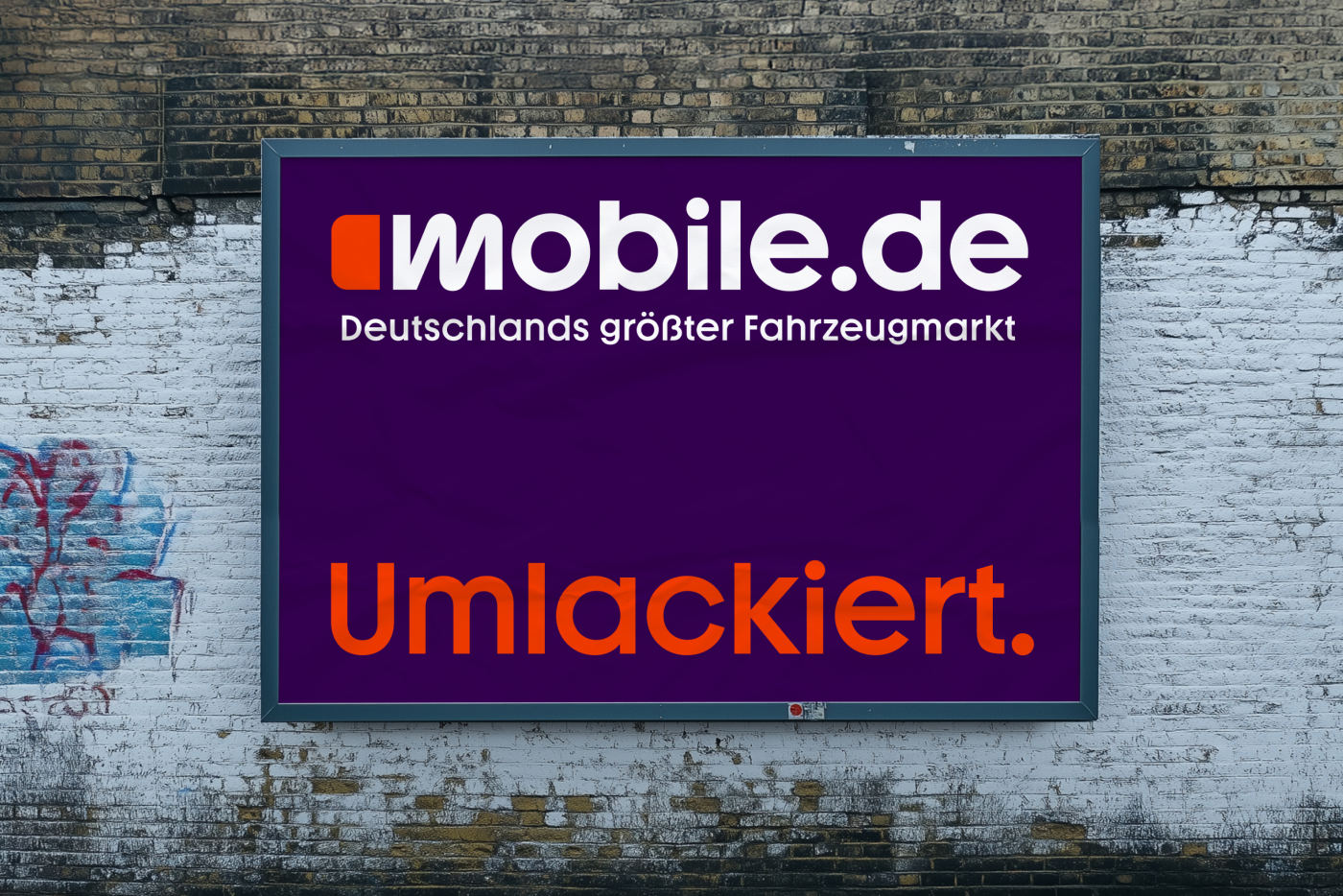
Orange stays - the rest is new
The corporate colour ‘mobile.de Orange’ was changed to a strong tone and complemented by the colours purple and light blue. Combined with the striking ‘Mobile Youth’ corporate typeface, the design ensures that content is concise and legible on both desktop and mobile devices.
Clear, intuitive & mobile thinking
The mobile.de website and app will soon have a new look – optimised for those on the move. With the new look, Germany’s largest car market will remain a strong partner for dealers – and at the same time become more relevant to new, digitally savvy buyers.