
Veltins
The New Pale Lager
New in stock
Lager beers are becoming increasingly popular in Germany. Veltins is one of the first major German beer brands to enter this segment in order to appeal to a younger, socially active target audience. The goal was to create a modern, future-oriented brand identity that can stand up to its international competitors.
The category of lagers follows different visual and content-related codes than those of the classic pilsner. It was important to take these codes into account while still appealing to classic beer consumers and Veltins customers.
The result is a modern and holistic brand identity that feels consistent across the entire product range, from communication to spatial presence.
The Essence of the Emblem
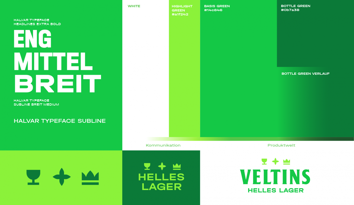
We reinterpreted the essential elements of the classic Veltins logo to give the new brand a modern look. The three iconic elements – crown, star and cup – were transformed to symbolize the qualities of the new lager: quality, freshness and conviviality.
A Modern Twist on pilsner
The color scheme, with the light green of Veltins’ brand DNA and an increased white space, reflects the beer’s fresh character, while also highlighting its mildness. The flexible typeface system, which reinterprets the classic Veltins typography, adds a modern touch.
Entering the International Market
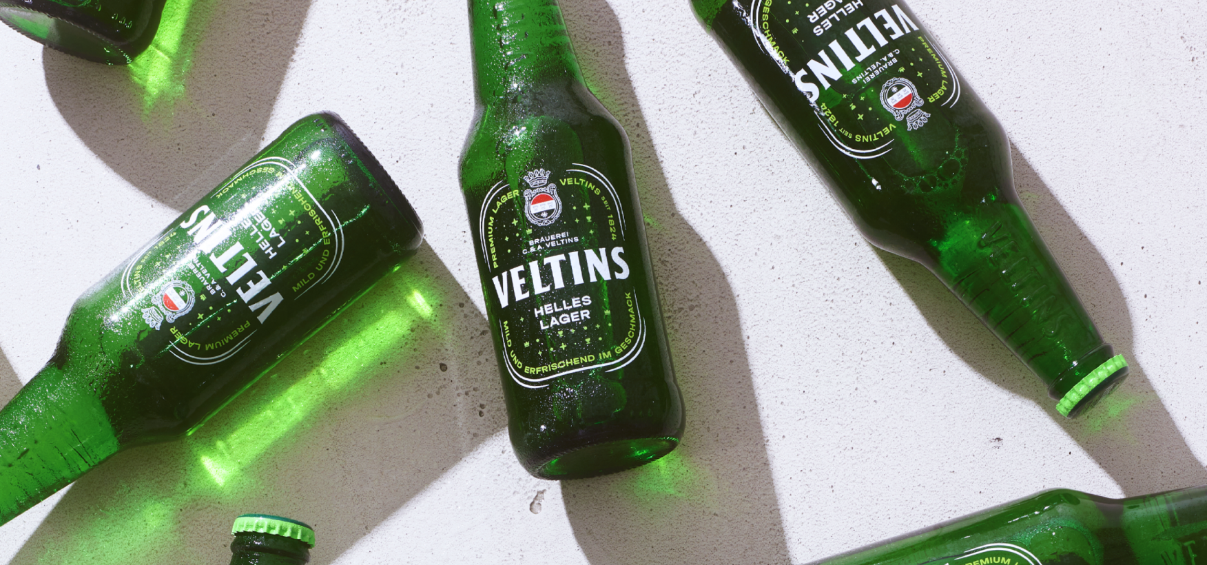
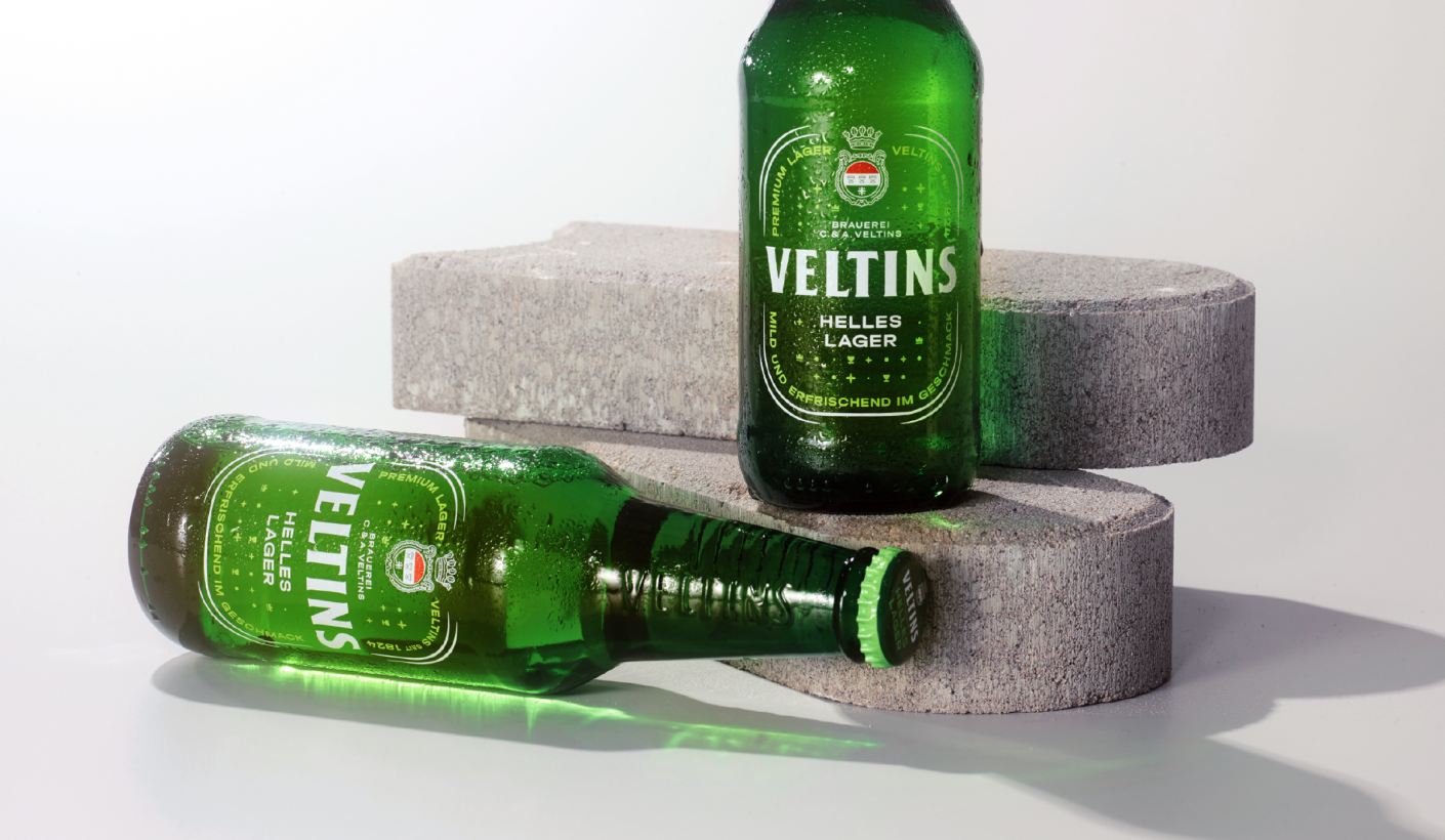
The pale lager is not only getting its own label design. The handy bottle with the front label branded onto it is making an impression on the German market with an internationally appealing, smaller packaging unit. Crown corks, six-packs and returnable crates have also been specially developed for the new product.


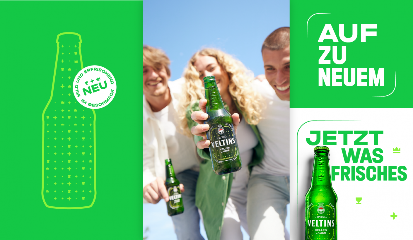
Mild, Fresh and New
This is not only our product promise – it is also the core of the brand’s communicative identity. By strongly differentiating it from the pilsner, we created a modern, revolutionary appearance that fits well with the Veltins family and strengthens the young brand identity.


